Josef Münzberger.
—cartography—storytelly—dataviz—music—
My Name
Born and based in Prague, Czechia.
Graduated from CTU Prague in 2021.
Started Ph.D. studies in 2021 at CTU Prague, focusing on thematic cartography and spatial data visualization.
Member of Drama Club, Prague since 2022 as a Sound Engineer.
A lifelong musician, playing in several bands and composing music for theatre productions.
My Maps
Prague Squared
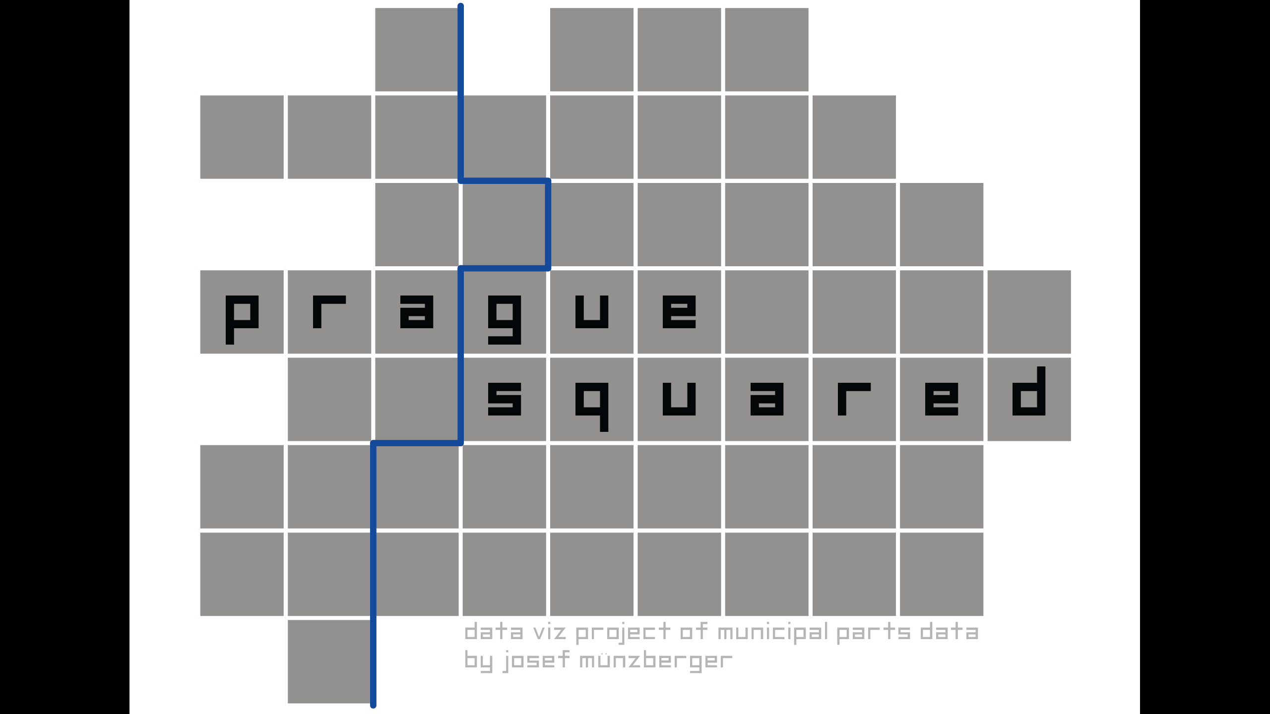
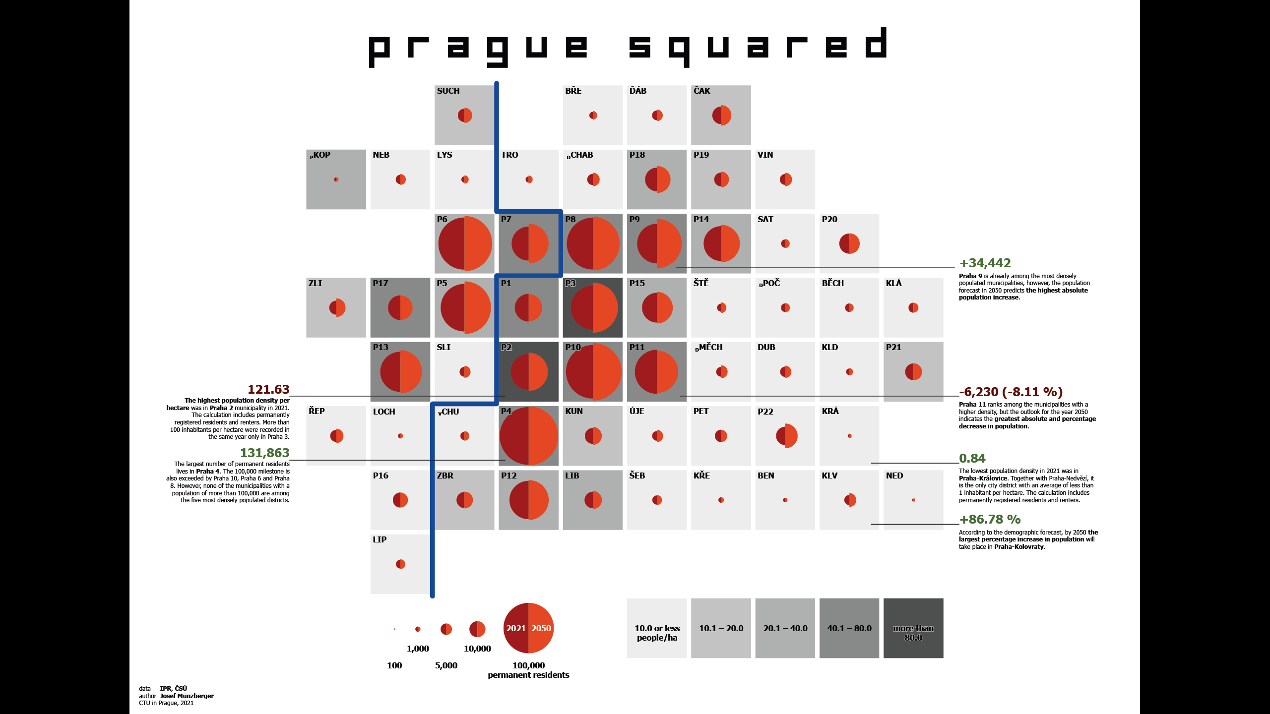
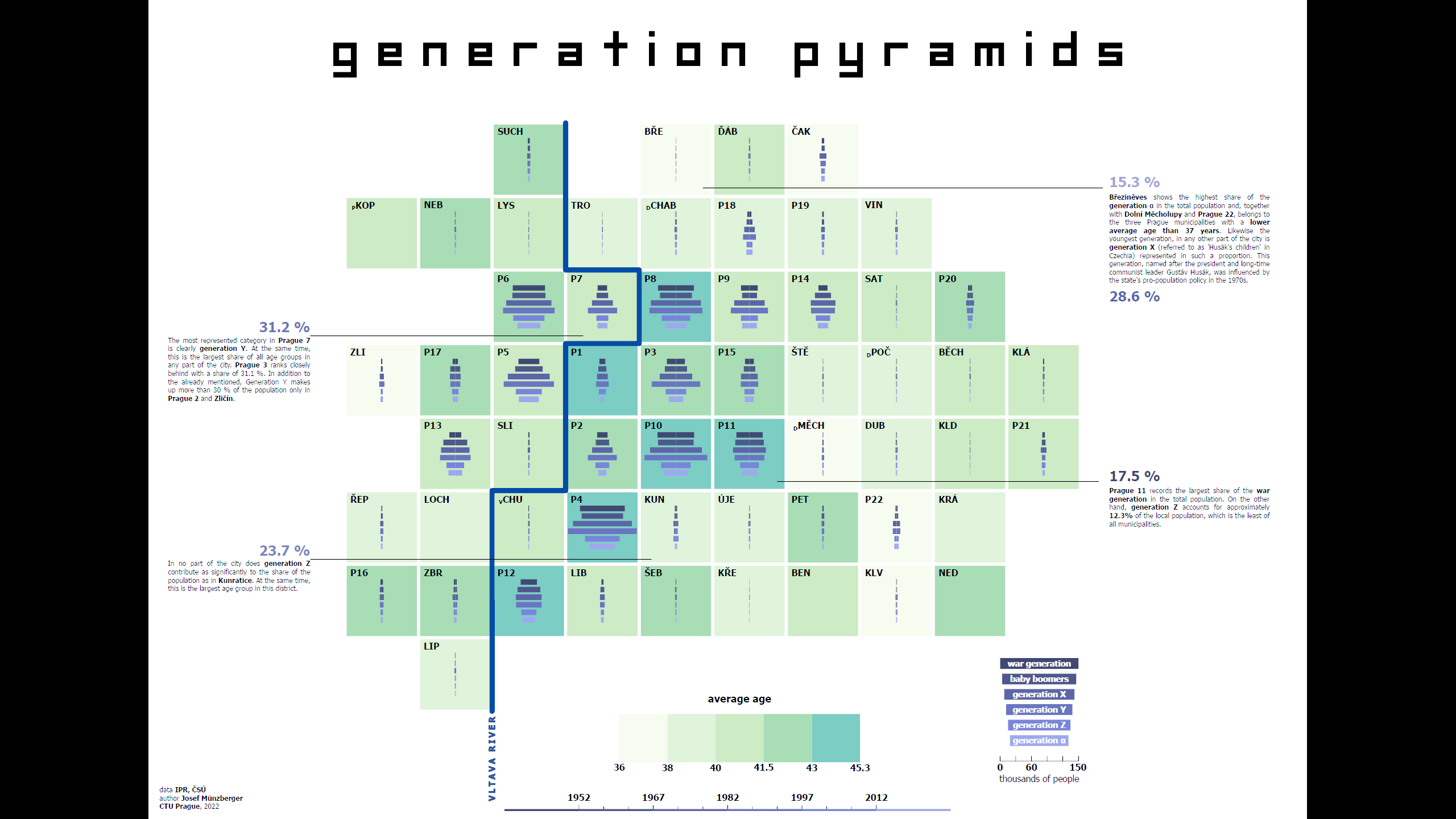
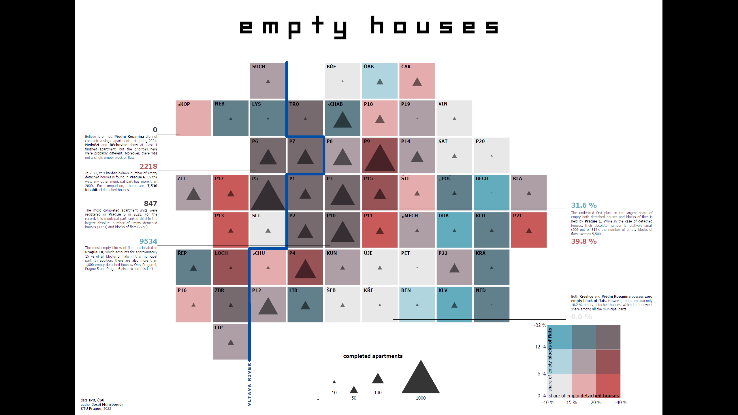
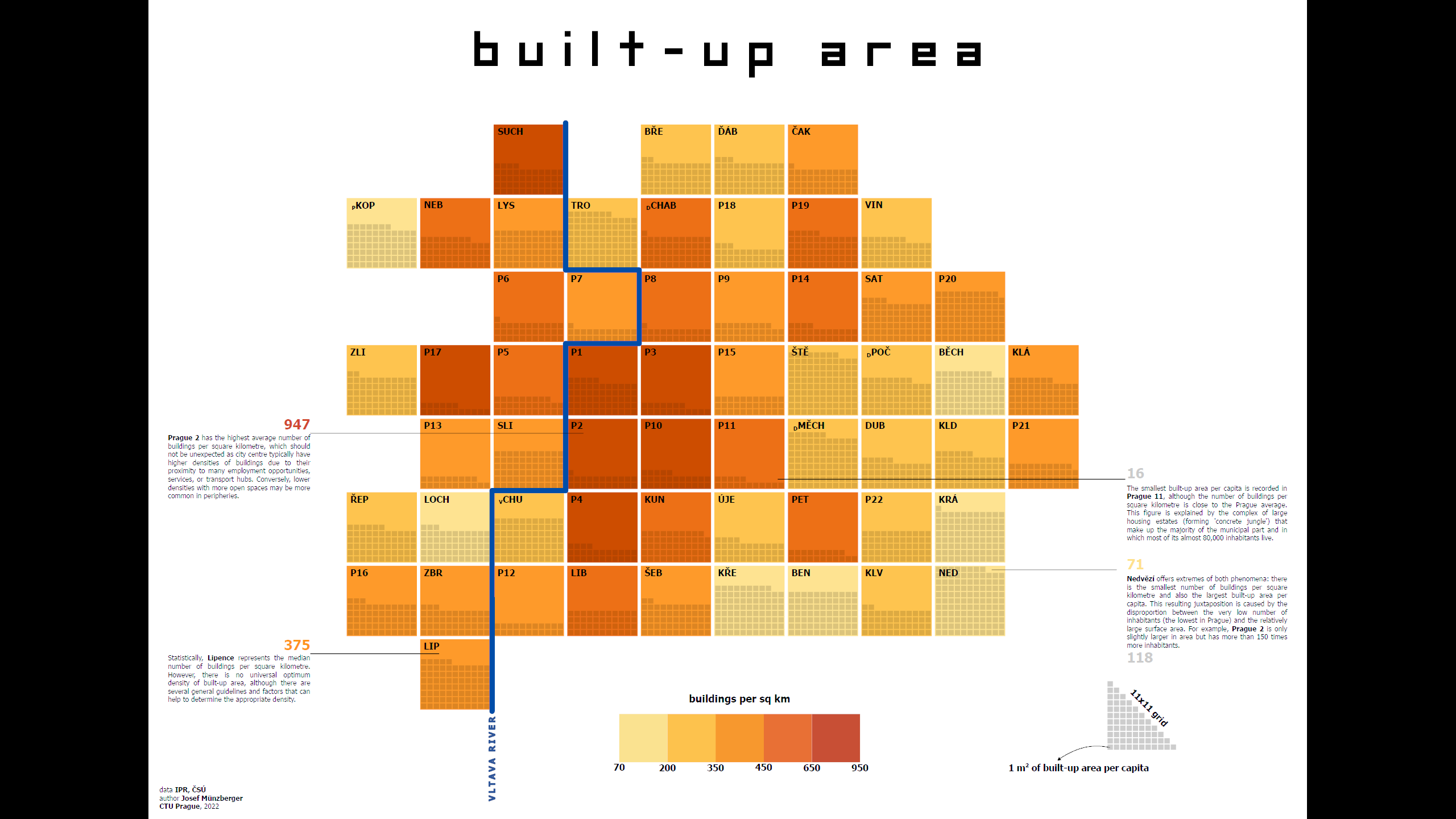
Prague Squared is my project that intends to effectively visualise the statistical data of Prague using selected methods of thematic cartography, principles of visual perception and information graphics. The aim is to bring an alternative and unconventional way of visually easy communication of statistical information of municipal parts. However, irregular municipal divisions can create conflicts between thematic content, geometric structure, and annotations. This project overcomes such limitations by using a cartographic anamorphosis (an area cartogram) where municipal parts are represented as squares while preserving spatial contiguity. A key geographical feature, the generalized Vltava River, enhances orientation and municipal parts names are abbreviated for clarity. The project employs a combination of choropleth and proportional symbol techniques, ensuring multiple data layers are readable. This approach provides a structured, legible, and intuitive way to provide insight into the relationships between data and can reveal connections, trends or correlations.
More thinking behind Prague Squared in my paper.
Dante's Inferno StoryMap
The StoryMap application is built on the author’s master thesis, which is devoted to the spatial exploration of a literary imaginary place: Dante’s Underworld. The thesis analyses and interprets a literature concept of Dante’s Inferno from a cartographic and geographic point of view. It seeks spatial data within the Divine Comedy verses, which can be consequently used to determine the exact location, size, and dimensions of hell. The presentation is focused on the entire StoryMap creation workflow: data collection, visualisation, and technical implementation.
The research includes the initial scientific attempts to map the Inferno. Two different hell designs calculated by Manetti and Vellutello are examined based on Galileo’s two academic lectures and Comedy itself. Especially Manetti’s parameters are emphasized and subsequently incorporated into the author’s maps and a 3D model, which form the final StoryMap. According to Dante, Inferno resembles an enormous conical abyss with its vertex in the centre of the Earth divided into certain levels in which various sins are punished. A set of two maps (created in ArcGIS software) and a 3D model (constructed in SketchUp) was prepared for the topic. The main objective of the first map is to project the borders of principal Inferno sections (so-called circles) onto the Earth’s surface. The second map is dedicated to the detailed structure of the Inferno (e.g., circles and its rings) including all characters Dante met during his pilgrimage through the otherworld. For this purpose, a database of every named sinner and devil in the first part of Comedy (i.e., Inferno) was compiled. Although the exact coordinates of the characters cannot be derived from the poem (except for Lucifer), each one is unambiguously linked to one of the Inferno rings. Since Manetti calculated even the trajectory of Dante’s journey, it was possible to estimate the character’s location along that line (within an appropriate ring) regarding the chronological order as they appear in Comedy. The trajectory of Dante’s wayfaring through the hell is shown as well. The final StoryMap is designed to introduce the spatial aspects of Dante’s Inferno while reflecting a richly cartographic nature of his writing. Created for multiple levels of detail, both maps reveal the content gradually to narrate the story of mapping hell step by step. Selected map features are interactive and offer additional information using pop-ups. In the first detail, the terrestrial places relevant to the hell’s location are highlighted. Furthermore, projected boundaries of the Inferno circles are indicated on the Earth’s surface in a composition with a medieval cities network. Afterwards, the view is focused on the Inferno structure itself and a point layer representing all Comedy characters is exposed when zoomed. Among the Inferno ring attributes included in pop-ups belong its width and a height above the middle of the Earth, a brief description, a reference to an appropriate canto in Comedy, a specific sin, an illustration by G. Doré, etc. Ultimately, the StoryMap de facto fulfils the function of an interactive Comedy encyclopaedia. Moreover, map windows are enriched by a sidebar with text. For each zoom level, it contains a significant verse according to which Manetti or Galileo determined some aspect or parameter concerning Inferno structure and an accompanying text regarding the currently displayed map features.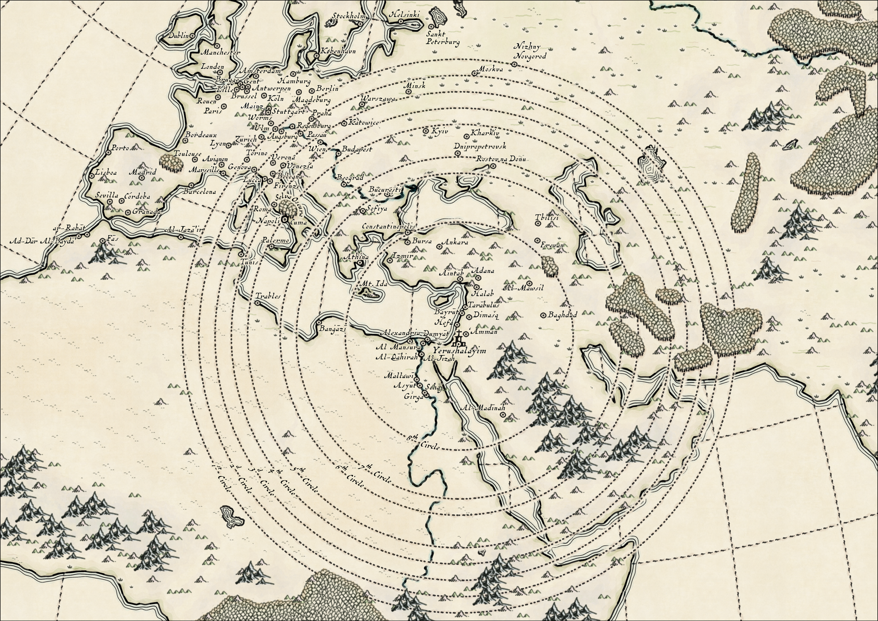
Joyplot
Probably one of the most iconic music album covers was created in 1979 for the album Unknown Pleasures by the British band Joy Division. The author of the design, Peter Saville, based his design on the radio waves of the first discovered pulsar, which was captured by the Arecibo Observatory in Puerto Rico. The original image of the recorded signal from space was first published in 1970 by Harold D. Craft in his doctoral thesis, from which it was subsequently taken into The Cambridge Encyclopaedia of Astronomy. The graphic artist later converted the original into inverse colours, giving rise to a motif that evokes the mysterious, unexplored land, but also, for example, sound waves.
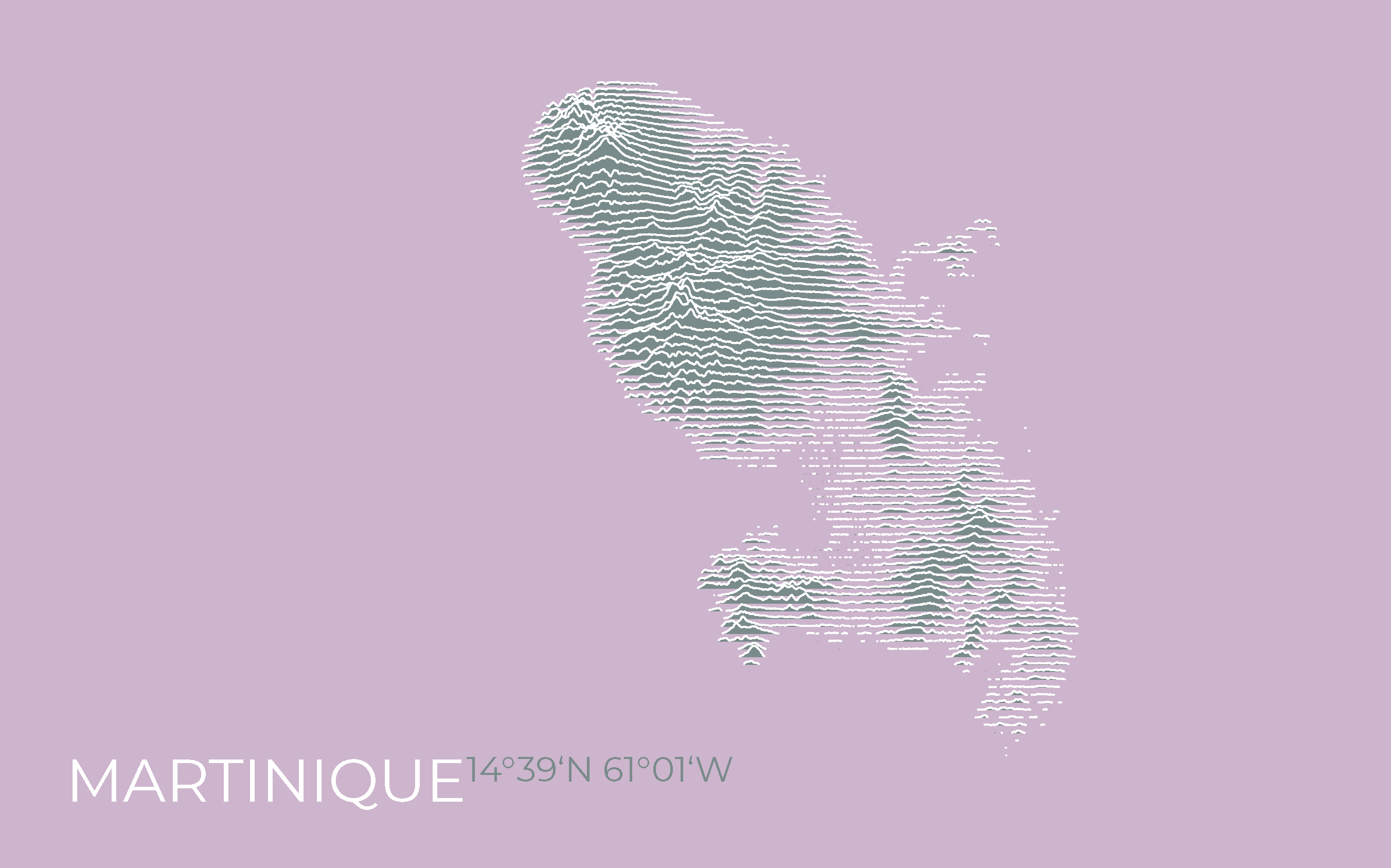
The data visualisation method derived from the aforesaid is called Joy Plot or Ridgeline Plot, referring to its resemblance to a ridgeline. Essentially, it is a series of line plots interpreting usually statistical data. Moreover, the setting within the framework of the Cartesian system encourages the creation of maps where the X and Y axes correspond to longitude and latitude, respectively. The 'height' of each line can then be used to express a range of spatial phenomena; most commonly, in a cartographic context, elevation or population density.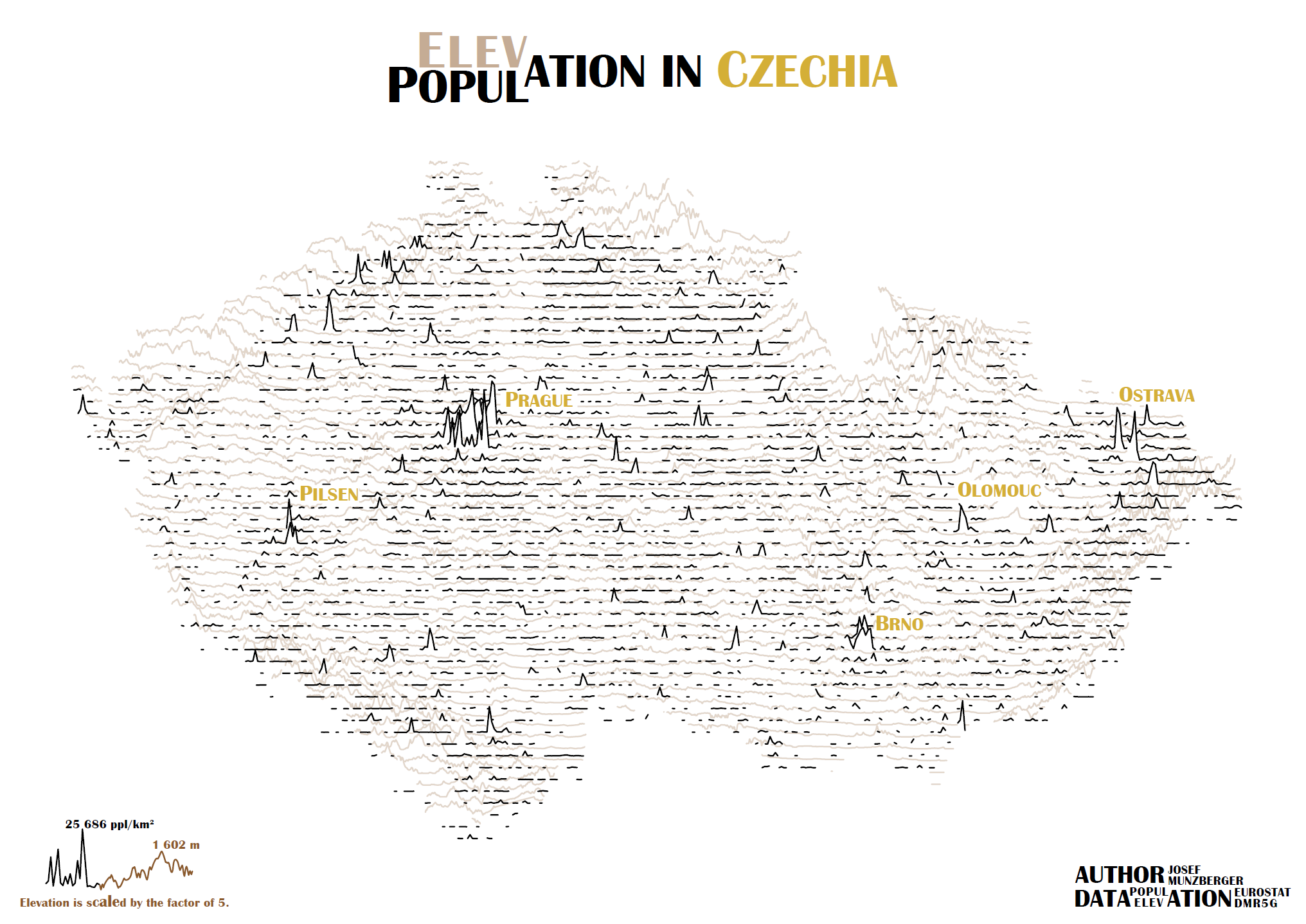
More joy?
Do you fancy joyplots? There are few more in pop art style. If you like it, contact me for deal offer!
Beatles Tour map
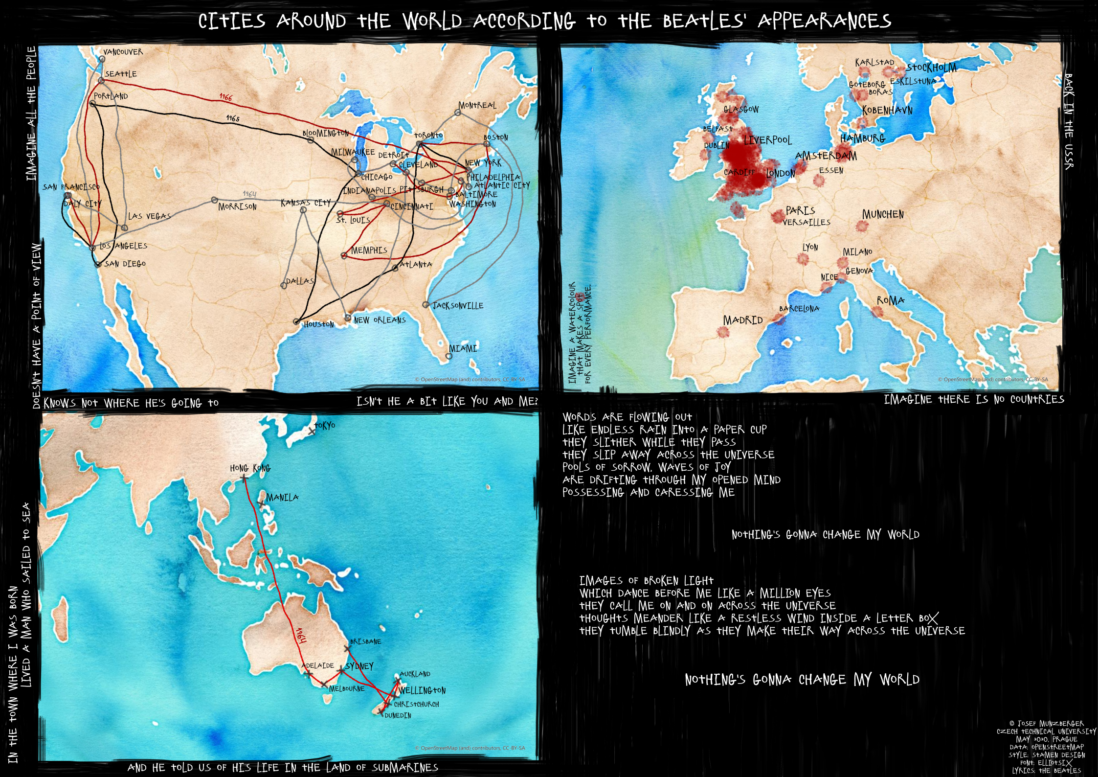
Map depicting world cities according to the Beatles' shows was created during my 4th year at Czech Technical University in Prague. Consisting of three map frames dedicated to Europe, North America and Australia, it uses different technics to display band tours in America on one hand or number of performances in Europe cities on the other.
My Models
The Chinese Pavilion
The unique building of the Chinese Pavilion (no. 118), built in 1821–1822, is located in the park of the Cibulka estate in Prague 5. The transformation of the site was carried out by the Bishop of Passau, Leopold Leonhard Thun-Hohenstein, who bought the land in 1817 and had the whole area radically redesigned. The dominant building became an Empire mansion surrounded by a romantic English park with a number of sculptures and small romantic buildings, the most important of which is the Chinese Pavilion. After the death of Count Thun in 1826, neither the heirs nor the later owners were able to invest sufficient funds in the complex for maintenance, and the grounds, including the pavilion, fell into disrepair after the mid-19th century. There is evidence of major structural alterations from 1929–1930, but the building is decaying again. In 1958, the pavilion was declared a cultural monument of the Czech Republic and finally in 2019, work began on the overhaul of the entire building.
My Music
The Jay
Asibásně
Contact Me
Prague, Czechia
+420 732 651 698
josef.munzberger@fsv.cvut.cz